Siddhesh B.
Siddhesh B.
End-to-End Design Leadership
Designing a mobile-first trading experience from scratch to dev handoff that balances real-time data complexity with on-the-go usability.


My Role
UI/UX Designer & Consultant
Methods
UI/UX research & design
Visual design
Wireframing & Prototyping
Documentation + Dev Handoff
Video


Video walkthrough
Adding soon
The Problem & Challenges
Stakeholder Alignment & Vision
Understanding and translating the company's business goals into a mobile experience that serves both novice and experienced traders, requiring constant collaboration & prioritization of features.
Understanding and translating the company's business goals into a mobile experience that serves both novice and experienced traders, requiring prioritization of features.
Mobile-First Trading Complexity
Condensing the full power of a desktop trading platform into a mobile interface without overwhelming users. Traders needed quick access to critical data while on the move.
The WinForms platform was built for a single desktop environment with no responsive design, making it unusable on laptops, tablets, or ultrawide monitors.
Real-Time Data Visualization
Designing charts and market data displays that remain readable and actionable on smaller screens during high-pressure trading moments, while maintaining the depth that serious traders expect.
Inconsistent UI patterns and the absence of a design system created visual chaos and cognitive overload for traders managing complex strategies.
Approach


Step 1
Deep Discovery & Research
Conducted stakeholder interviews to understand business objectives and user research with traders to map their mobile usage patterns, identifying when and why they trade on mobile versus desktop.
Methods used
Stakeholder & User Interviews
Journey Mapping & Task Analysis
Heuristic Evaluation & Competitive Analysis
Journey Mapping & Task Analysis
6+ Methods
Step 2
Iterative Design Process
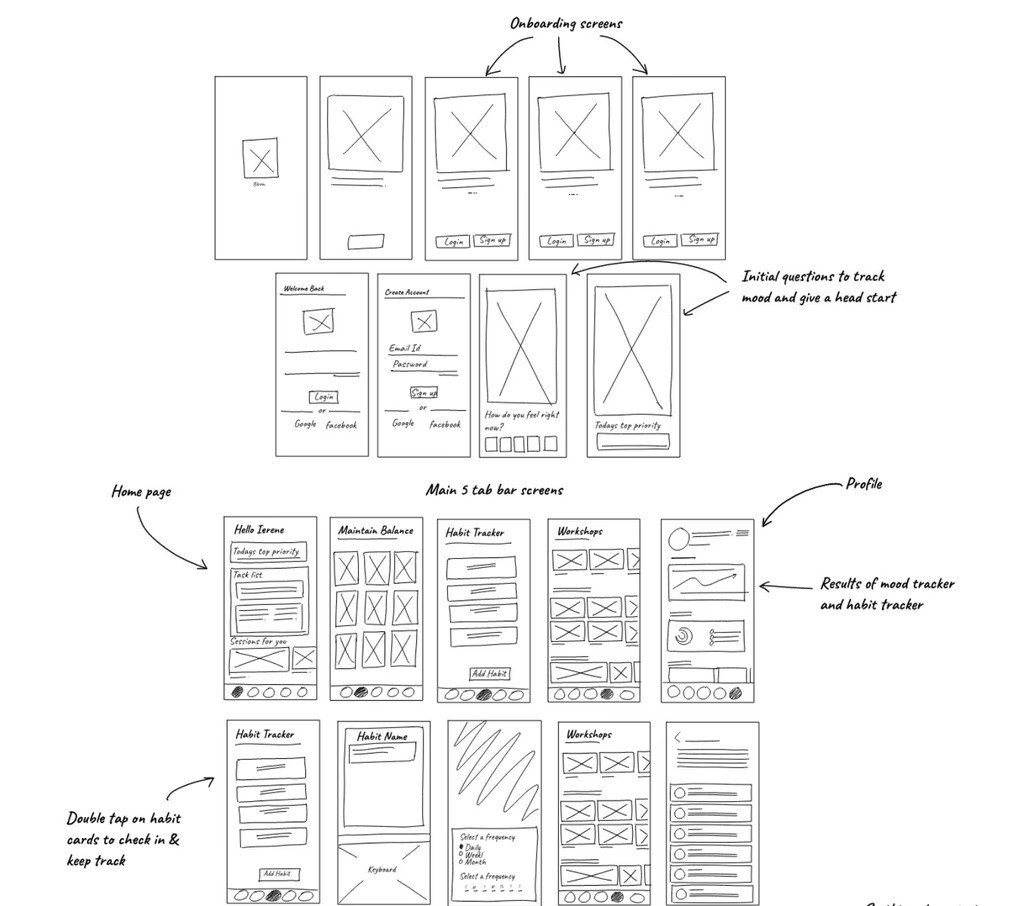
Started with user flows to define the mobile journey, then moved through low-fidelity wireframes for quick validation before refining high-fidelity designs based on stakeholder and user feedback.

Step 3
System Building & Documentation
Created a comprehensive design system in Figma with reusable components and clear documentation, ensuring consistency across the mobile experience while enabling efficient developer handoff.
What I Did in This Project

User Research & Interviews

User Flows & Wireframing

Design System & Component Library

Visual Design

Design Documentation & Iteration

Developer Handoff
Final Output & Result


The results are in. See what we achieved.

The mobile platform brought professional trading capabilities into a pocket-sized experience from the ground up. By translating complex web features into mobile-optimized workflows, traders can now execute critical actions instantly without switching devices.
30% faster task completion through mobile-optimized workflows
40% increase in feature adoption with intuitive, accessible tools
35% boost in cross-platform engagement
Successfully integrated core web features enabling instant action from anywhere
Another project you might find Interesting


Final Output & Result
End-to-End Design Leadership
Designing a mobile-first trading experience from scratch to dev handoff that balances real-time data complexity with on-the-go usability.
My Role
UI/UX Designer & Consultant
Methods
UI/UX research & design
Visual design
Wireframing & Prototyping
Documentation + Dev Handoff
Video
Video walkthrough
Adding soon
Approach
Step 1
Deep Discovery & Research
Conducted stakeholder interviews to understand business objectives and user research with traders to map their mobile usage patterns, identifying when and why they trade on mobile versus desktop.
Methods used
Stakeholder - User Interviews
Competitive Analysis
6+ Methods
Step 2
Iterative Design Process
Started with user flows to define the mobile journey, then moved through low-fidelity wireframes for quick validation before refining high-fidelity designs based on stakeholder and user feedback.
Step 3
System Building & Documentation
Created a comprehensive design system in Figma with reusable components and clear documentation, ensuring consistency across the mobile experience while enabling efficient developer handoff.
Final Output & Result
What I Did in This Project
User Research & Interviews
User Flows & Wireframing
Design System & Component Library
Visual Design
Design Documentation & Iteration
Developer Handoff
The results are in. See what we achieved.
The mobile platform brought professional trading capabilities into a pocket-sized experience from the ground up. By translating complex web features into mobile-optimized workflows, traders can now execute critical actions instantly without switching devices.
30% faster task completion through mobile-optimized workflows
40% increase in feature adoption with intuitive, accessible tools
35% boost in cross-platform engagement
Successfully integrated core web features enabling instant action from anywhere
Another project you might find Interesting
Siddhesh B.
Let's connect
Belhekarsiddhesh9@gmail.com
Stay happy, Stay safe,
Stay with love one's
Siddhesh B.
Let's connect
Belhekarsiddhesh9@gmail.com
Stay happy, Stay safe,
Stay with love one's
Stay happy, Stay safe,
Stay with love one's